


 Apex Code Development
 You need to sign in to do that
Don't have an account?
How to modify the quick action's modal popup
I was trying to place a quick action to display custom lightning component to show a PDF. The quick action popup coming with a default header and footer. The footer has only one cancel action button but we need 3 action button to perform savePDF, emailPDF and cancel.
To achieve this I have created a custom header, body and footer using slds styling. But the content is displayed on the modal popup's body area with some padding and margin.
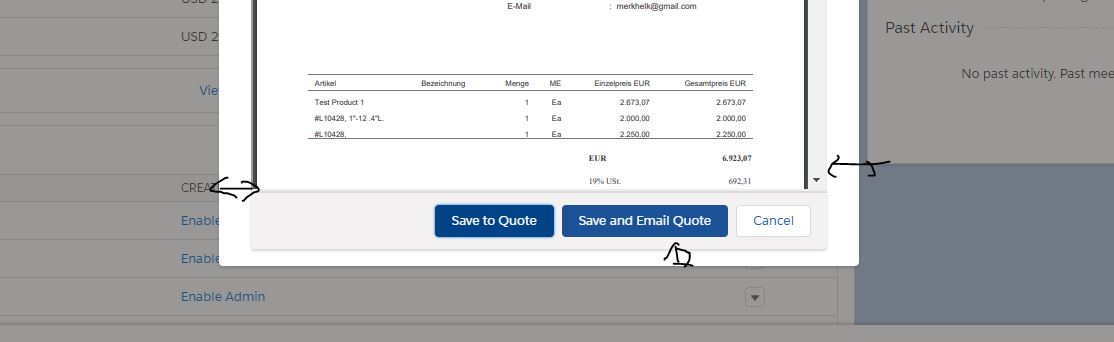
Please help me to modify the padding and margin without affecting other quick action popups on the page.
To achieve this I have created a custom header, body and footer using slds styling. But the content is displayed on the modal popup's body area with some padding and margin.
Please help me to modify the padding and margin without affecting other quick action popups on the page.
<aura:html tag="style"> .cuf-content { padding: 0 0rem !important; } .slds-p-around--medium { padding: 0rem !important; } .slds-modal__content{ overflow-y:hidden !important; height:unset !important; max-height:unset !important; } </aura:html>All Answers
You can do this with following CSS addition:
<style>
  .uiContainerManager .uiModal.forceModal .modal-container .modal-body.scrollable.slds-p-around--medium,
  .uiContainerManager .uiModal.forceModal .modal-container .modal-body.scrollable.slds-p-around--medium .cuf-content {
    padding: 0!important;
  }

  .uiContainerManager .uiModal.forceModal .modal-container .modal-body.scrollable.slds-modal__content {
    overflow: visible!important;
    overflow-y: visible!important;
  }
</style>
Directly add this CSS to the component code.Thanks,
Nagendra
You can directory use the CSS in the CSS file or in the tags that you are using in the component
@Nagendra Thanks for the comment.
Style tag is not supported by the component due to locker service. THIS tag should be added to each style in the style part of the component.
I tried with including custom style class into our component <ltng:require> but it modifies the other quick action popup container styles also.
Thanks,
Anil
<aura:html tag="style"> .cuf-content { padding: 0 0rem !important; } .slds-p-around--medium { padding: 0rem !important; } .slds-modal__content{ overflow-y:hidden !important; height:unset !important; max-height:unset !important; } </aura:html>@Briana
Thanks. I have found out the style changes already but unable to place it within the component other than the help of external CSS file. It's been a great workaround to solve my issue.