


 Apex Code Development
 You need to sign in to do that
Don't have an account?
 Shikha Devi 16
 slds progress indicator css is not working properly.
HI,
I am working on lightning component where I need progress indicator. I am using slds progress indicator but it is not showing css same as shown in the slds guide.
I have used the same code mentioned in the guide.https://www.lightningdesignsystem.com/components/progress-indicator/#flavor-base-default
But still it is not showing connecting line of two button. please find screenshot of issue.
According to guide image bar should look like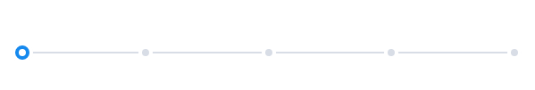
Please help me on the same
Thanks
Shikha
Please try given below code
<aura:component >
<div class="slds-progress">
<ol class="slds-progress__list">
<li class="slds-progress__item slds-is-active">
<button class="slds-button slds-progress__marker" aria-describedby="step-1-tooltip">
<span class="slds-assistive-text">Step 1 - Active</span>
</button>
</li>
<li class="slds-progress__item">
<button class="slds-button slds-progress__marker" aria-describedby="step-2-tooltip">
<span class="slds-assistive-text">Step 2 </span>
</button>
</li>
<li class="slds-progress__item">
<button class="slds-button slds-progress__marker" aria-describedby="step-3-tooltip">
<span class="slds-assistive-text">Step 3 </span>
</button>
</li>
<li class="slds-progress__item">
<button class="slds-button slds-progress__marker" aria-describedby="step-4-tooltip">
<span class="slds-assistive-text">Step 4 </span>
</button>
</li>
<li class="slds-progress__item">
<button class="slds-button slds-progress__marker" aria-describedby="step-5-tooltip">
<span class="slds-assistive-text">Step 5 </span>
</button>
</li>
</ol>
<div class="slds-progress-bar slds-progress-bar_x-small">
<span class="slds-progress-bar__value" style="width:0%;">
<span class="slds-assistive-text">Progress: 0%</span>
</span>
</div>
</div>
</aura:component>
All Answers
below code is working fine in my org.
<aura:component >
	<div class="slds-progress">
  <ol class="slds-progress__list">
    <li class="slds-progress__item slds-is-active">
      <button class="slds-button slds-progress__marker" aria-describedby="step-1-tooltip">
        <span class="slds-assistive-text">Step 1 - Active</span>
      </button>
    </li>
    <li class="slds-progress__item">
      <button class="slds-button slds-progress__marker" aria-describedby="step-2-tooltip">
        <span class="slds-assistive-text">Step 2 </span>
      </button>
    </li>
    <li class="slds-progress__item">
      <button class="slds-button slds-progress__marker" aria-describedby="step-3-tooltip">
        <span class="slds-assistive-text">Step 3 </span>
      </button>
    </li>
    <li class="slds-progress__item">
      <button class="slds-button slds-progress__marker" aria-describedby="step-4-tooltip">
        <span class="slds-assistive-text">Step 4 </span>
      </button>
    </li>
    <li class="slds-progress__item">
      <button class="slds-button slds-progress__marker" aria-describedby="step-5-tooltip">
        <span class="slds-assistive-text">Step 5 </span>
      </button>
    </li>
  </ol>
  <div class="slds-progress-bar">
    <span class="slds-progress-bar__value" style="width:0%;">
      <span class="slds-assistive-text">Progress: 0%</span>
    </span>
  </div>
</div>
</aura:component>
test app<aura:application extends="force:slds"> <c:progressBar/> </aura:application>even I am using same code still progress bar is coming without connecting line.
can you share your exact code once and from where do you run your lightning component ?
thanks
<aura:component >
<div class="slds-progress">
<ol class="slds-progress__list">
<li class="slds-progress__item slds-is-active">
<button class="slds-button slds-progress__marker" aria-describedby="step-1-tooltip">
<span class="slds-assistive-text">Step 1 - Active</span>
</button>
</li>
<li class="slds-progress__item">
<button class="slds-button slds-progress__marker" aria-describedby="step-2-tooltip">
<span class="slds-assistive-text">Step 2 </span>
</button>
</li>
<li class="slds-progress__item">
<button class="slds-button slds-progress__marker" aria-describedby="step-3-tooltip">
<span class="slds-assistive-text">Step 3 </span>
</button>
</li>
<li class="slds-progress__item">
<button class="slds-button slds-progress__marker" aria-describedby="step-4-tooltip">
<span class="slds-assistive-text">Step 4 </span>
</button>
</li>
<li class="slds-progress__item">
<button class="slds-button slds-progress__marker" aria-describedby="step-5-tooltip">
<span class="slds-assistive-text">Step 5 </span>
</button>
</li>
</ol>
<div class="slds-progress-bar">
<span class="slds-progress-bar__value" style="width:0%;">
<span class="slds-assistive-text">Progress: 0%</span>
</span>
</div>
</div>
</aura:component>
App :
<aura:application extends="force:slds">
<div>Test</div><br/>
<div>
<c:test />
</div>
</aura:application>
Please try given below code
<aura:component >
<div class="slds-progress">
<ol class="slds-progress__list">
<li class="slds-progress__item slds-is-active">
<button class="slds-button slds-progress__marker" aria-describedby="step-1-tooltip">
<span class="slds-assistive-text">Step 1 - Active</span>
</button>
</li>
<li class="slds-progress__item">
<button class="slds-button slds-progress__marker" aria-describedby="step-2-tooltip">
<span class="slds-assistive-text">Step 2 </span>
</button>
</li>
<li class="slds-progress__item">
<button class="slds-button slds-progress__marker" aria-describedby="step-3-tooltip">
<span class="slds-assistive-text">Step 3 </span>
</button>
</li>
<li class="slds-progress__item">
<button class="slds-button slds-progress__marker" aria-describedby="step-4-tooltip">
<span class="slds-assistive-text">Step 4 </span>
</button>
</li>
<li class="slds-progress__item">
<button class="slds-button slds-progress__marker" aria-describedby="step-5-tooltip">
<span class="slds-assistive-text">Step 5 </span>
</button>
</li>
</ol>
<div class="slds-progress-bar slds-progress-bar_x-small">
<span class="slds-progress-bar__value" style="width:0%;">
<span class="slds-assistive-text">Progress: 0%</span>
</span>
</div>
</div>
</aura:component>