


 Apex Code Development
 You need to sign in to do that
Don't have an account?
LWC: change color of lightning-button-icon
Hello everybody,
do someone know how to change the color of lightning-button-icon to white?
Based on this example (https://lightningdesignsystem.com/components/modals/#Small-Modal) I've build the following modal window:
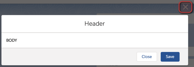
Everything works fine, except the color of the button-icon.
Does someone know how to style this button into white?
Greetings,
Christian
do someone know how to change the color of lightning-button-icon to white?
Based on this example (https://lightningdesignsystem.com/components/modals/#Small-Modal) I've build the following modal window:
Everything works fine, except the color of the button-icon.
Does someone know how to style this button into white?
Greetings,
Christian
Relpace the below Lines in your HTML modal header with the below highlighted one:
<header class="slds-modal__header">
<button class="slds-button slds-button_icon slds-modal__close slds-button_icon-inverse" title="Close">
<svg class="slds-button__icon slds-button__icon_large" aria-hidden="true">
<use xlink:href="/assets/icons/utility-sprite/svg/symbols.svg#close"></use>
</svg>
<span class="slds-assistive-text">Close</span>
</button>
<h2 id="modal-heading-01" class="slds-modal__title slds-hyphenate">Modal Header</h2>
</header>
=============
<header class="slds-modal__header">
<button class="slds-button slds-button_icon slds-modal__close slds-button_icon-inverse" title="Close" onclick={closeModal}>
<lightning-icon icon-name="utility:close"
alternative-text="close"
variant="inverse"
size="small" ></lightning-icon>
<span class="slds-assistive-text">Close</span>
</button>
<h2 id="modal-heading-01" class="slds-modal__title slds-hyphenate">Header</h2>
</header>
Thanks,
Maharajan.C
All Answers
Relpace the below Lines in your HTML modal header with the below highlighted one:
<header class="slds-modal__header">
<button class="slds-button slds-button_icon slds-modal__close slds-button_icon-inverse" title="Close">
<svg class="slds-button__icon slds-button__icon_large" aria-hidden="true">
<use xlink:href="/assets/icons/utility-sprite/svg/symbols.svg#close"></use>
</svg>
<span class="slds-assistive-text">Close</span>
</button>
<h2 id="modal-heading-01" class="slds-modal__title slds-hyphenate">Modal Header</h2>
</header>
=============
<header class="slds-modal__header">
<button class="slds-button slds-button_icon slds-modal__close slds-button_icon-inverse" title="Close" onclick={closeModal}>
<lightning-icon icon-name="utility:close"
alternative-text="close"
variant="inverse"
size="small" ></lightning-icon>
<span class="slds-assistive-text">Close</span>
</button>
<h2 id="modal-heading-01" class="slds-modal__title slds-hyphenate">Header</h2>
</header>
Thanks,
Maharajan.C
thanks for your response.
It was my fault not to show my current implementation.
For me it is currently not clear how to set a white color for the X.
My current implementation looks like the following:
<!-- @TODO: Close-Button is not shown in white color. --> <template> <template if:true={show}> <section role="dialog" tabindex="-1" aria-labelledby="modal-heading-01" aria-modal="true" aria-describedby="modal-content-id-1" class="slds-modal slds-fade-in-open"> <div class="slds-modal__container"> <header class="slds-modal__header"> <lightning-button-icon variant="bare" size="large" icon-name="utility:close" onclick={handleCloseClickHandler} class="slds-modal__close"> </lightning-button-icon> <h2 class="slds-modal__title slds-hyphenate"> <slot name="header"></slot> </h2> <p class={taglineClass}> <slot name="tagline" onslotchange={handleTaglineChange} ></slot> </p> </header> <div class="slds-modal__content slds-p-around_medium"> <slot name="body"></slot> </div> <footer class="slds-modal__footer"> <slot name="footer"></slot> </footer> </div> </section> <template if:true={backdropOpen}> <div class="slds-backdrop slds-backdrop_open"></div> </template> </template> </template>Try the below one:
<template>
<template if:true={show}>
<section role="dialog" tabindex="-1" aria-labelledby="modal-heading-01" aria-modal="true" aria-describedby="modal-content-id-1" class="slds-modal slds-fade-in-open">
<div class="slds-modal__container">
<header class="slds-modal__header">
<button class="slds-button slds-button_icon slds-modal__close slds-button_icon-inverse" title="Close" onclick={handleCloseClickHandler}>
<lightning-icon icon-name="utility:close"
alternative-text="close"
variant="inverse"
size="small" ></lightning-icon>
<span class="slds-assistive-text">Close</span>
</button>
<h2 class="slds-modal__title slds-hyphenate">
<slot name="header"></slot>
</h2>
<p class={taglineClass}>
<slot
name="tagline"
onslotchange={handleTaglineChange}
></slot>
</p>
</header>
<div class="slds-modal__content slds-p-around_medium">
<slot name="body"></slot>
</div>
<footer class="slds-modal__footer">
<slot name="footer"></slot>
</footer>
</div>
</section>
<template if:true={backdropOpen}>
<div class="slds-backdrop slds-backdrop_open"></div>
</template>
</template>
</template>
Thanks,
Maharajan.C
that works perfectly! Thanks a lot.
But I ask myself why it doesn't work like the following with lightning-button-icon?
Do you know why?
<lightning-button-icon variant="bare" size="large" icon-name="utility:close" onclick={handleCloseClickHandler} class="slds-modal__close"> </lightning-button-icon>Currently am not having that idea on this.
But i have tried the CSS to acheive this. There also i faced some difficulties.
Please mark the best answer which on helps to you...
Thanks,
Maharajan.C