


 Apex Code Development
 You need to sign in to do that
Don't have an account?
Complex Graph
Hi,
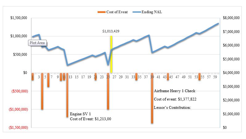
Would like to know if its possible to graph something similar to this using the google chart in VF? If so would like to know how its possible and head start to it.
Thanks in advance
S.Aj
Would like to know if its possible to graph something similar to this using the google chart in VF? If so would like to know how its possible and head start to it.
Thanks in advance
S.Aj
<apex:page sidebar="false" showHeader="false"> <script src="//ajax.googleapis.com/ajax/libs/jquery/1.10.2/jquery.min.js"></script> <script src="//cdnjs.cloudflare.com/ajax/libs/d3/3.3.3/d3.min.js"></script> <script src="//cdnjs.cloudflare.com/ajax/libs/nvd3/1.0.0-beta/nv.d3.min.js"></script> <script> $(document).ready(function(){ // Make sure you're using a MATRIX Report $.ajax('/services/data/v29.0/analytics/reports/{!$CurrentPage.parameters.reportId}', { beforeSend: function(xhr) { xhr.setRequestHeader('Authorization', 'Bearer {!$Api.Session_ID}'); }, success: function(response) { console.log(response); var chart = nv.models.multiBarChart(); var chartData = []; $.each(response.groupingsDown.groupings, function(di, de) { var values = []; chartData.push({"key":de.label, "values": values}); $.each(response.groupingsAcross.groupings, function(ai, ae) { values.push({"x": ae.label, "y": response.factMap[de.key+"!"+ae.key].aggregates[0].value}); }); }); d3.select('#chart').datum(chartData).transition().duration(500).call(chart); } } ); }); </script> <svg id="chart" height="500px" width="500px"></svg> </apex:page>http://www.infallibletechie.com/search/label/Visualforce%20Charting
Thanks for the answer. Anyhow the graph is related to a custom object forecasting and we are using Visual force charting this is how it originally look likes
I'd like to add 2 vertical Y-axis, change the color of the bar when it has negative values, make the linear similar to the image initially attached in the post. also is there a way to control the values on the vertical axis as you can see it goes a lot lower than the required values.
<apex:chart data="{!TotalInfo}" height="500" width="75%" id="chart" name="chart">
        <apex:legend position="right" font="bold 14px Helvetica"/>
        <apex:axis type="Numeric" position="right" title="Cash flow in US Dollars" grid="true" fields="TotalCashflow,TotalCost,NetCashFlow">
         <apex:chartLabel />
        </apex:axis>
        <apex:axis type="Category" position="bottom" fields="Month" title="">
          <apex:chartLabel rotate="315"/>
        </apex:axis>
        <apex:barSeries orientation="vertical" axis="left"  stacked="false" xField="Month" yField="TotalCashflow,NetCashFlow"
        title="Cumulative Account Balance (Rent & MR), Net Cash Flow" colorSet="#BD8025,#00CC00" >
        </apex:barSeries>


        <apex:lineSeries title="Net Cash Flow" axis="left" xField="Month" yField="NetCashFlow"
            markerType="cross" markerSize="4" />
       <apex:lineSeries title="Total Cost" axis="left" xField="Month" yField="TotalCost"
            markerType="circle" markerSize="4" />
        <apex:lineSeries title="NMRB At EoM" axis="left" xField="Month" yField="NMRBAtEoM"
            markerType="cross" markerSize="2" />

     </apex:chart>
Any help aorund in this would be really helpful.
Thanks in advance
S.Aj