


 Apex Code Development
 You need to sign in to do that
Don't have an account?
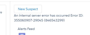
 bluecap
 Modal Issue
Hi all,
Trying to figure out an issue I have with a modal popup window. The error is very cryptic so Im hoping someone here can see what I am doing incorrectly. Basically I have a button group component that has one button (at the moment) and when clicked it needs to popup a modal window. At the moment the modal is failing to popup and displaying the following error.
Here's the failing code that Im attempting to use to dynamically create the modal window.
ButtonGroup.cmp
ButtonGroupController.js
ButtonGroupHelper.js - This function is supposed to create the modal from the modalDialog component and push the result into the optionalDialogDiv in the buttongroup component. But is failing at the moment.
modalDialog.cmp
modalDialogController.js
Trying to figure out an issue I have with a modal popup window. The error is very cryptic so Im hoping someone here can see what I am doing incorrectly. Basically I have a button group component that has one button (at the moment) and when clicked it needs to popup a modal window. At the moment the modal is failing to popup and displaying the following error.
Here's the failing code that Im attempting to use to dynamically create the modal window.
ButtonGroup.cmp
<aura:component implements="force:appHostable,flexipage:availableForAllPageTypes,flexipage:availableForRecordHome,force:hasRecordId" access="global" >

    <aura:dependency resource="markup://c:modalDialog" />

    <c:container class="demo-container" size="fluid" align="right">

        <c:buttonGroup >
            <c:button press="{!c.showModal}" type="neutral">New Suspect</c:button>
        </c:buttonGroup>

    </c:container>
    {!v.body}
    <div aura:id="optionalModalDialog">

    </div>

</aura:component>
ButtonGroupController.js
({
	showModal : function(component, event, helper) {
		helper.showModal(component,'Test Title','Test Message');
	},
    onDestroyModalDialog: function(component){
        var cmp = component.find('optionalModalDialog');
        cmp.set("v.body",[]);
    }
})
ButtonGroupHelper.js - This function is supposed to create the modal from the modalDialog component and push the result into the optionalDialogDiv in the buttongroup component. But is failing at the moment.
({
	showModal : function(component, title, message) {
        $A.createComponent(
            "c.modalDialog",
            {
                "title":title,
                "body":message,
                "onclose":component.getReference("c.onDestroyModalDialog")
            },
            function(msgBox){
                if(component.isValid()){
                    var targetCmp = component.find('optionalModalDialog');
                    var body = targetCmp.get("v.body");
                    body.push(msgBox);
                    targetCmp.set("v.body",body);
                }
            });

    }
})
modalDialog.cmp
<aura:component>
    <aura:attribute name="title" type="String" required="true" />
    <aura:attribute name="closable" type="Boolean" default="true"/>

    <aura:attribute name="closeLabel" type="String" default="Close"/>
    <aura:attribute name="cancelLabel" type="String" default=""/>
    <aura:attribute name="confirmLabel" type="String" default="OK"/>
    <aura:attribute name="aura-id" type="String" default=""/>

    <aura:attribute name="onclose" type="Aura.Action" default="{!c.defaultCloseAction}"/>
    <aura:attribute name="oncancel" type="Aura.Action" default="{!c.defaultCloseAction}"/>
    <aura:attribute name="onconfirm" type="Aura.Action" default="{!c.defaultCloseAction}"/>

    <aura:attribute name="showDialog" type="Boolean" default="true"/>

    <div class="slds">
        <!--class="{!'slds-modal '+((v.showDialog)?'slds-fade-in-open':'slds-fade-in-close')}" -->
        <div class="slds-modal slds-fade-in-open" aura:id="{!v.aura-id}" aria-hidden="false" role="dialog">
            <div class="slds-modal__container">
                <div class="slds-modal__header">
                    <h2 class="slds-text-heading--medium">{!v.title}</h2>
                    <aura:if isTrue="{!v.closable}">
                        <button class="slds-button slds-button--icon-inverse slds-modal__close" onclick="{!v.onclose}">
                            <c:svgIcon svgPath="{!$Resource.slds + '/assets/icons/action-sprite/svg/symbols.svg#close'}"
                                       category="standard"
                                       size="small"
                                       name="close" />
                            <span class="slds-assistive-text">{!v.closeLabel}</span>
                        </button>
                    </aura:if>

                </div>
                <div class="slds-modal__content slds-p-around--medium">
                    <div>
                        {!v.body}
                    </div>
                </div>
                <div class="slds-modal__footer">
                    <aura:if isTrue="{!v.cancelLabel != ''}">
                        <button class="slds-button slds-button--neutral" onclick="{!v.oncancel}">{!v.cancelLabel}</button>
                    </aura:if>
                    <button class="slds-button slds-button--neutral slds-button--brand" onclick="{!v.onconfirm}">{!v.confirmLabel}</button>
                </div>
            </div>
        </div>
        <!--<div class="{!'slds-backdrop '+((v.showDialog)?'slds-backdropDOUBLEDASHopen':'slds-backdropDOUBLEDASHclose')}"></div>-->
        <div class="slds-backdrop slds-backdrop--open"></div>

    </div>
</aura:component>
modalDialogController.js
({
	defaultCloseAction : function(component, event, helper) {
		$A.util.addClass(component,"hideModal");
	}

})
Thoughts?
Please check with the below link for similar issue and modify the code as per your requirement.
http://salesforce.stackexchange.com/questions/115092/how-to-display-modal-popup-with-a-form-inside-a-lightning-component
Please mark this as solved if it helps.
Best Regards,
Nagendra.P